Logos
Grace Gittel Lewis
May 2024
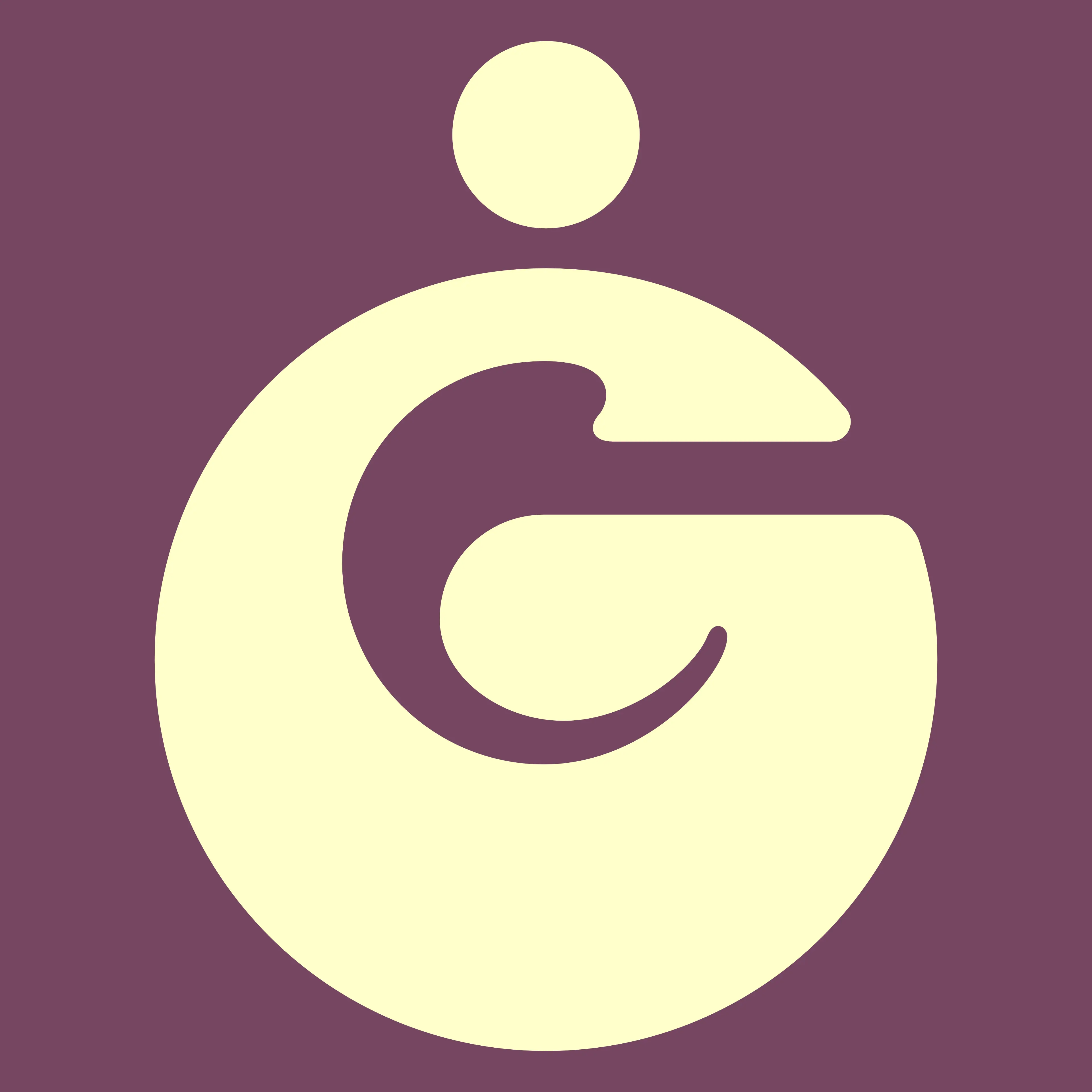
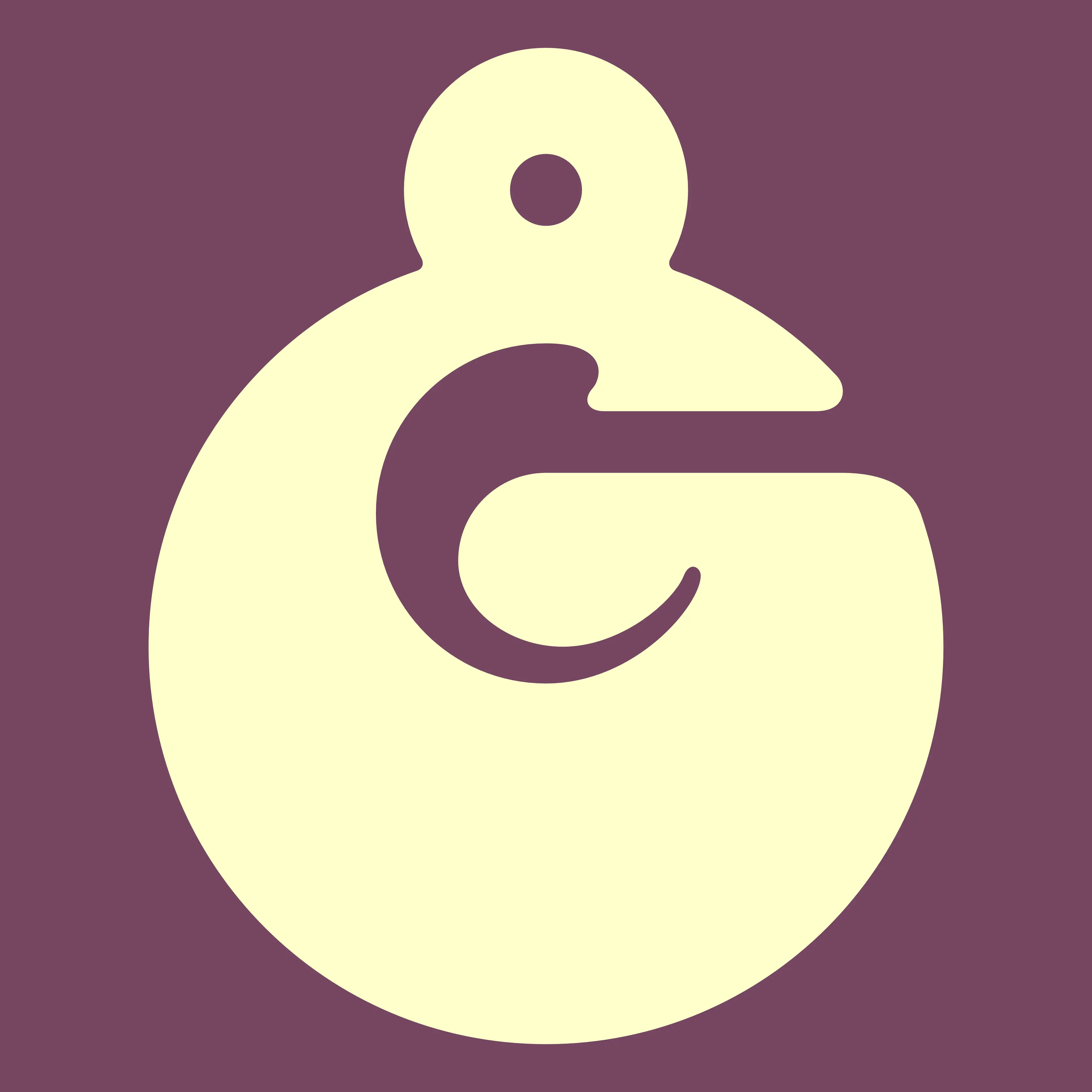
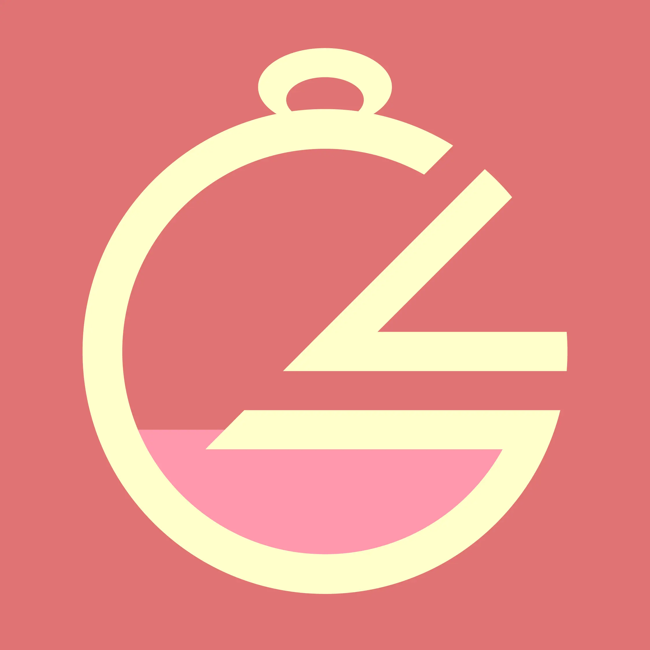
Having grown as a designer since I designed my first personal logo in 2020, I set out to create something that fit my personal standards and expanded knowledge while keeping some of the same inspiration and meaning intact. For years, I had used a pixel art image of a pocketwatch as my online avatar— so when I made my first logo, it was heavily inspired by this form. With my redesign, I wanted to preserve the pocket watch, while also making something more legible and much closer to my heart, as I felt the previous logo was much too akin to that you may see made for an e-sports team, not myself. So, the new logo takes inspiration from 70s styled typography, depicting a G for name (Grace), in a form akin to a pocket watch. Following this, in 2024, after more growth and a rebrand— I redesigned the logo once again. Now, I had ditched the original pocket watch even on my personal accounts, and needed to distance the design from that. I swapped the top loop to a circle, as this still gives the logo a memorable shape that can make a lasting impression. (Whereas a plain circular G would be easily forgotten.) I increased the size of the negative space within the G to make for a more legible icon, as well. So: up top is the latest logo, middle is the 2022 variant, and the bottom is the 2020 original.
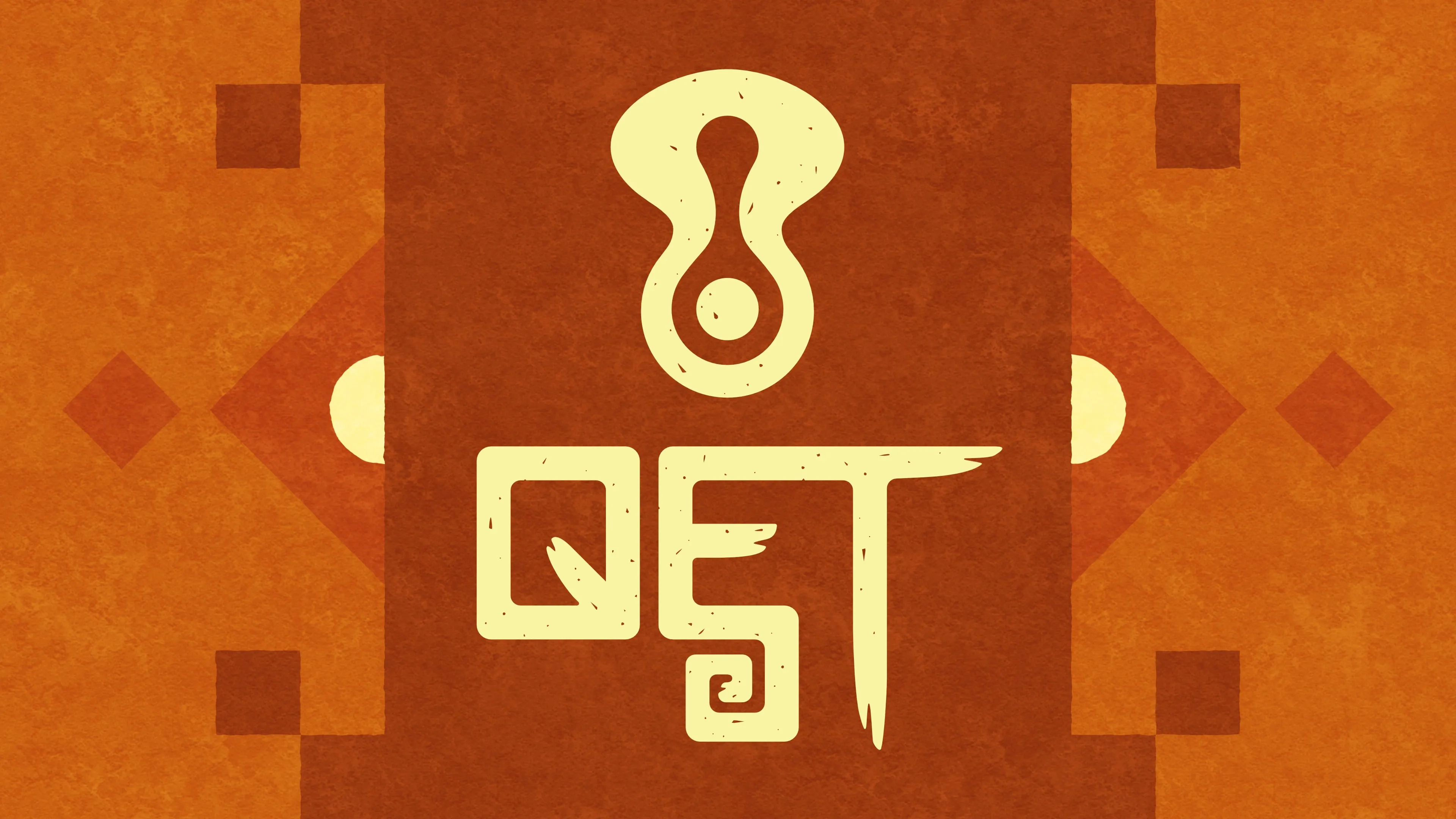
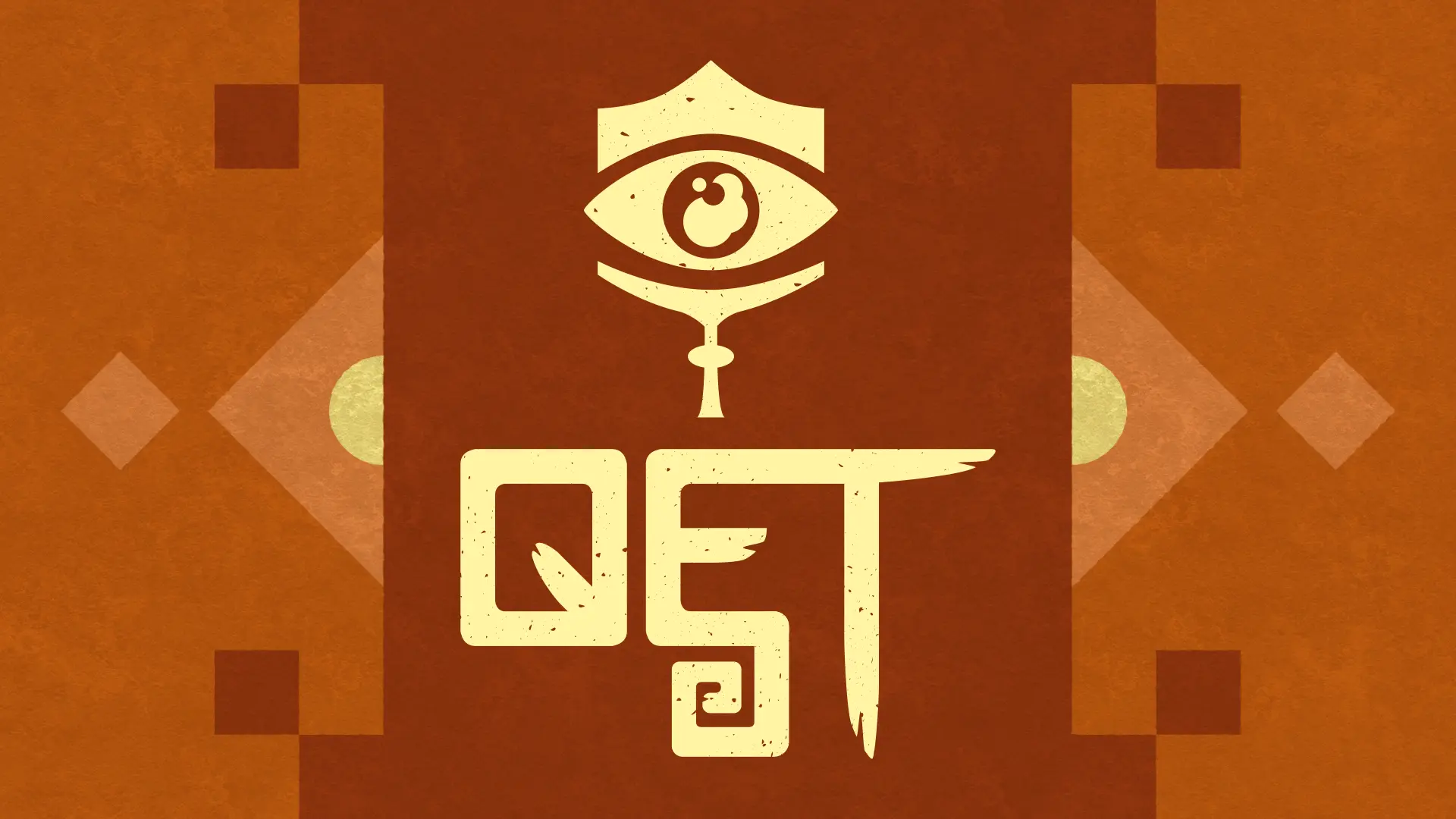
Qet
January 2021, Redesigned January 2023
A personal piece, done for my Qet project. Includes typographic and iconographic elements for use wherever I need. At the bottom, here, you can see the original logo and compare it to the current one to see how much my design skills have improved!
https://www.worldanvil.com/w/qet
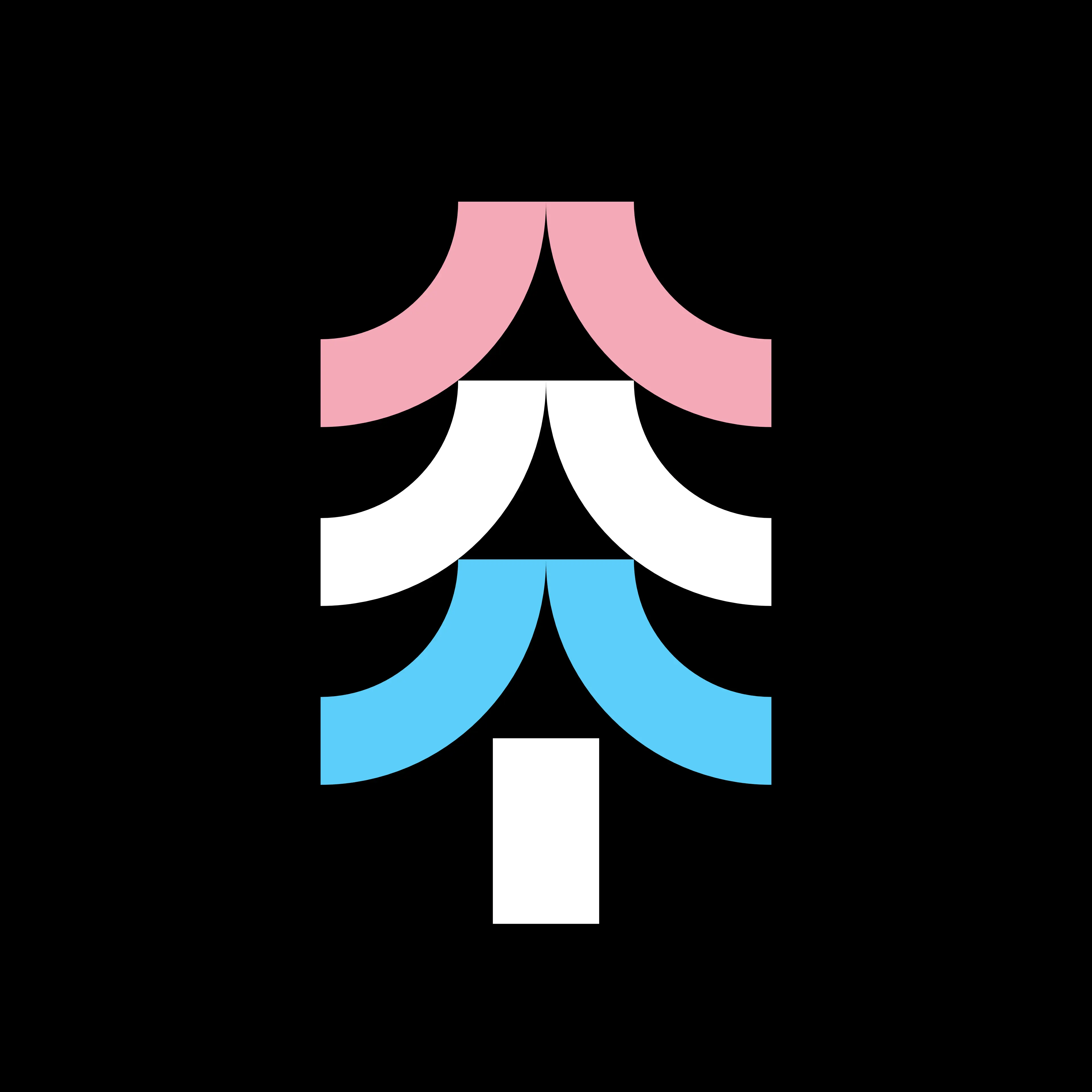
Sheltrans
May 2024
A logo for a local trans support group. The logo takes the form of a abstracted pine tree, as this is a rural town in the Pacific Northwest.
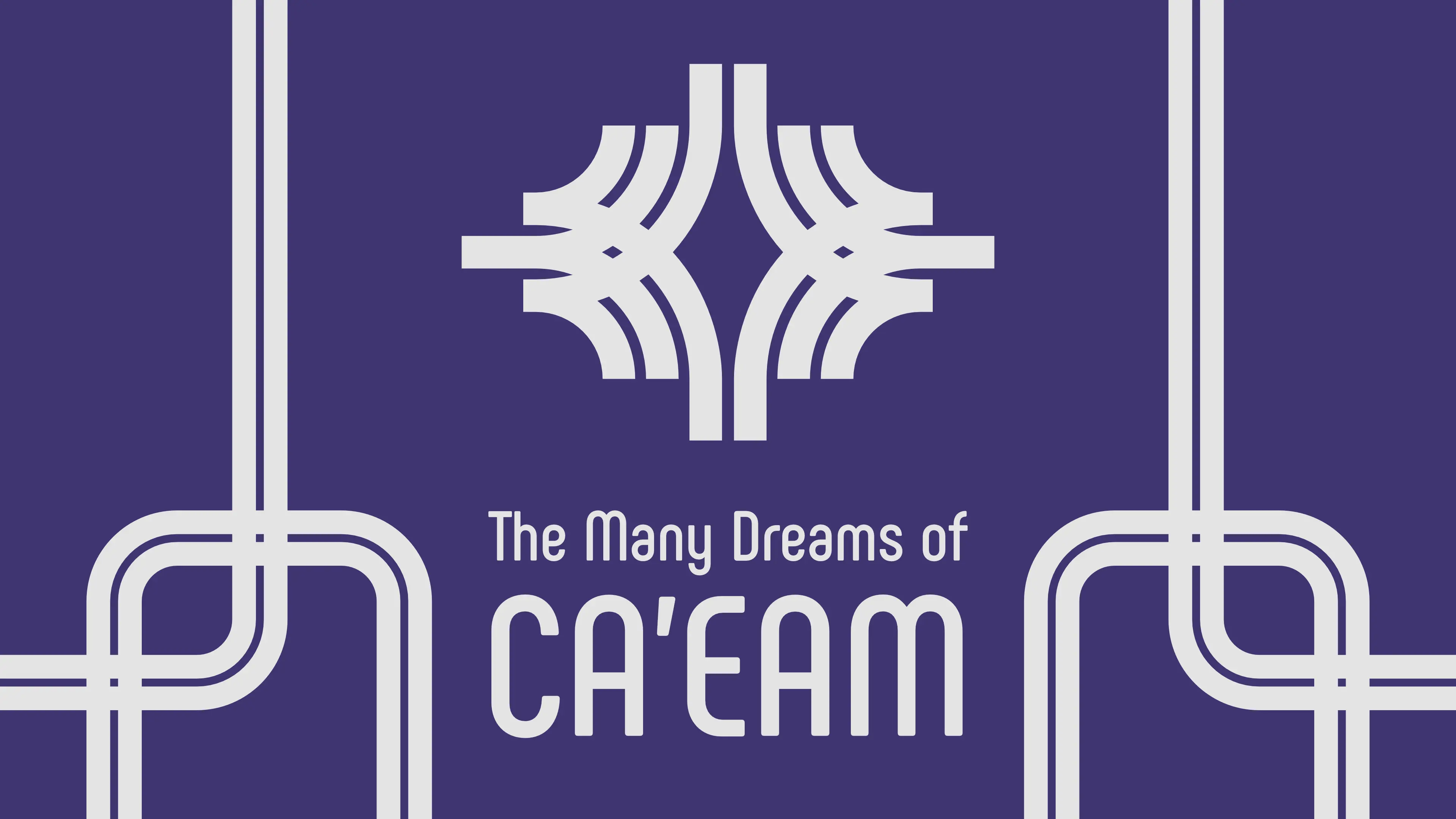
The Many Dreams of Ca'eam
June 2022
Done for my writing project, The Many Dreams of Ca'eam. Ca'eam, being a city, inspired me to base much of its design elements off of metro maps, utilizing clean lines running along, under, and over one another— with clean-cut sharp curves as needed.
https://www.worldanvil.com/w/the-many-dreams-of-ca-eam
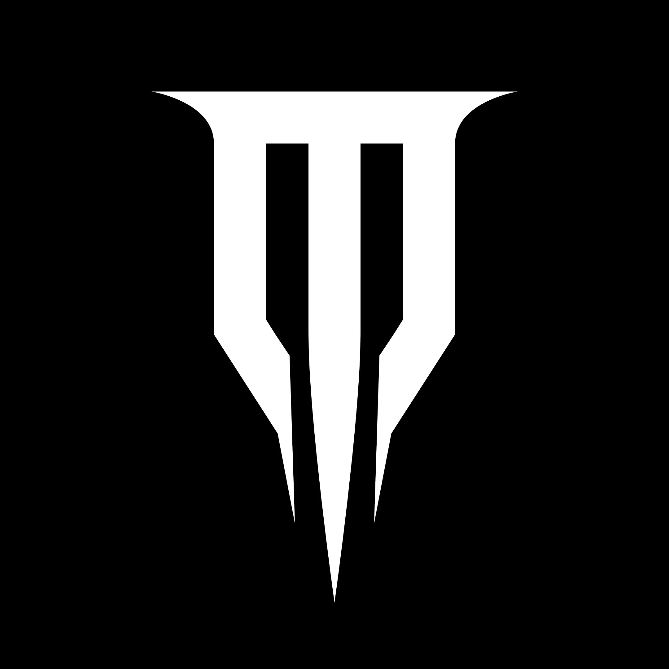
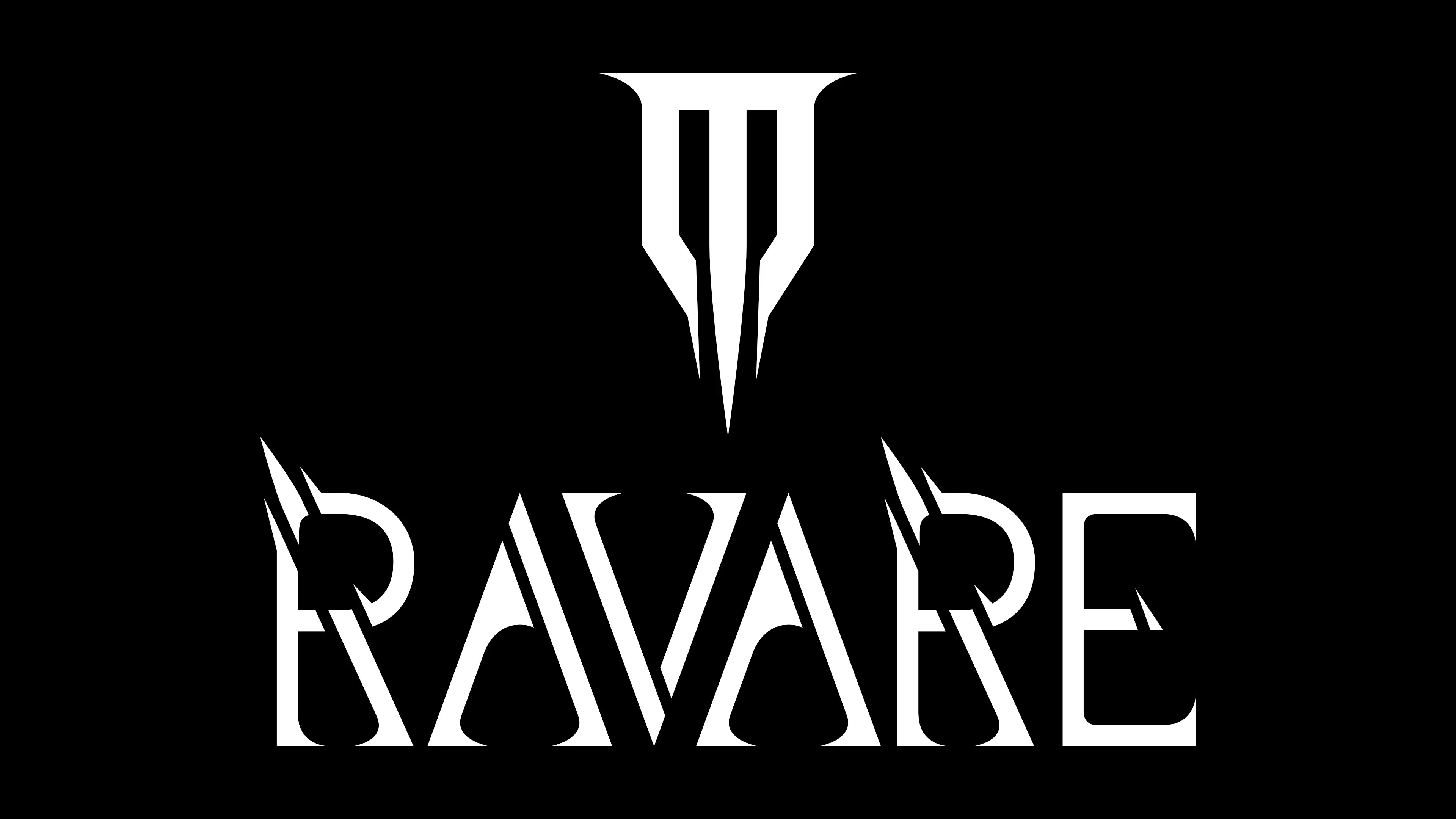
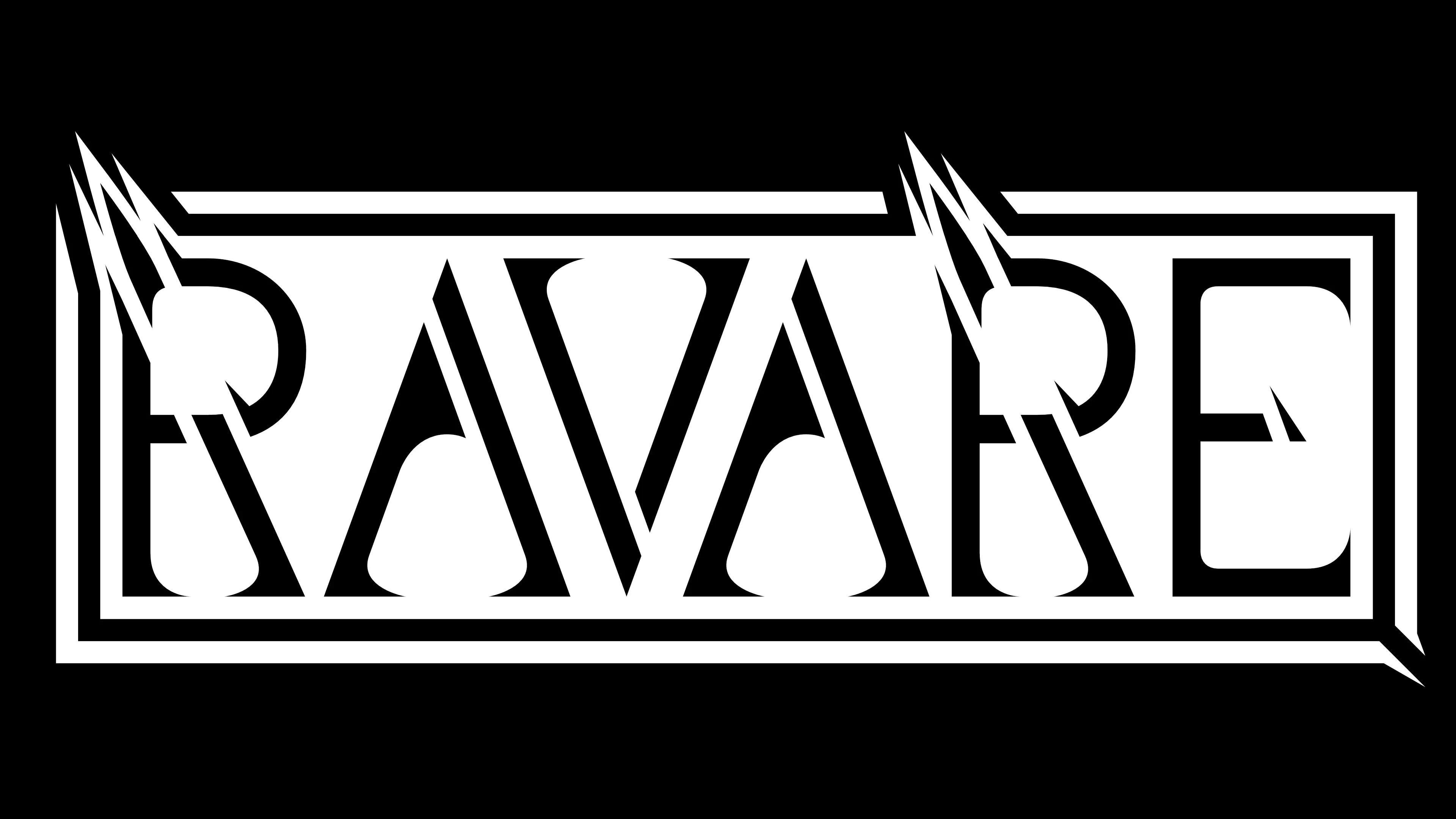
Ravare
July 2023
A commissioned logo for the Realms of Ravare fantasy narrative universe.
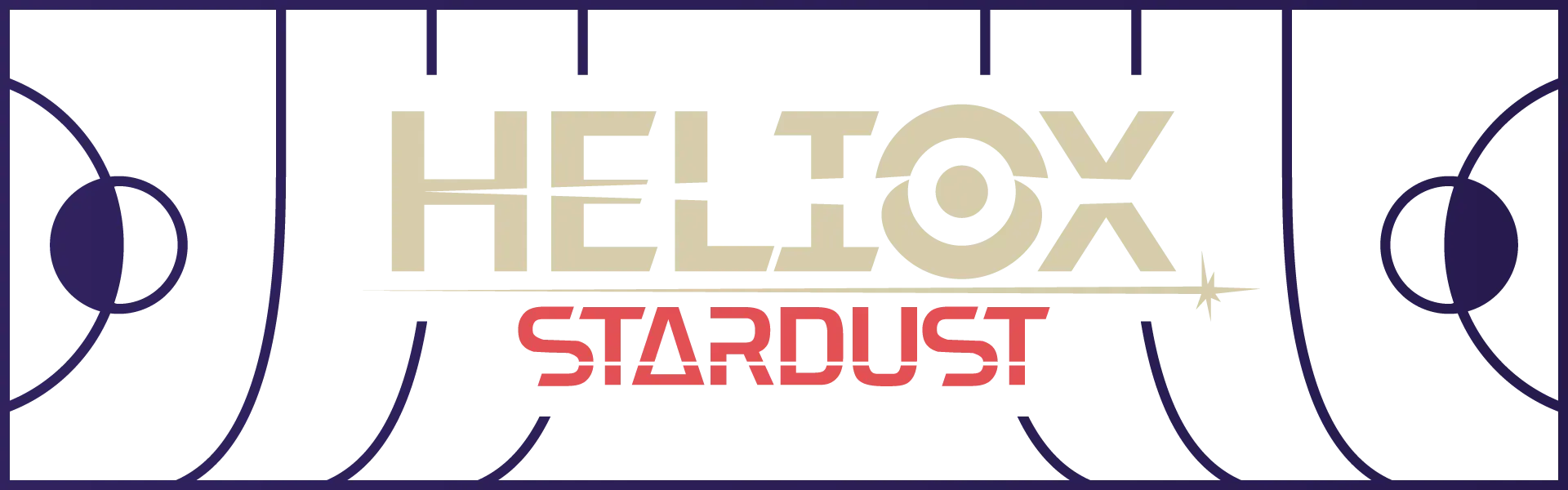
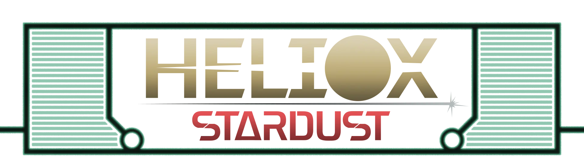
Heliox Stardust
February 2021
Done for My Heliox Stardust narrative setting. A typographic logo done in a sci-fi style. I reworked the logo almost a year later after realizing how horrid the original was. For comparison, the old logo can be seen at the bottom here.
https://www.worldanvil.com/w/heliox-stardust
GUTGUN
July 2023
Done for my GUTGUN project. This typographic logo works with tight, unusually stacked text beneath a straight line to create the image of— well, guts hanging from a gun!

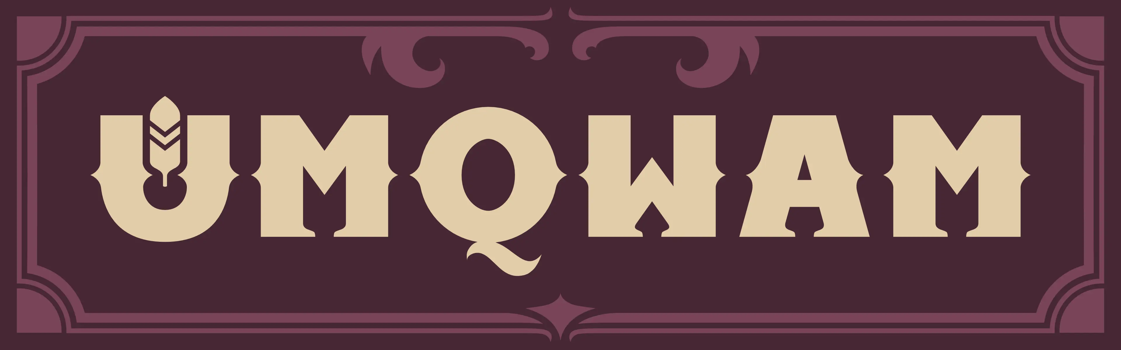
Umqwam
September 2023
For my Umqwam project, which is a fantasy western setting involving anthropomorphic bird cowboys.

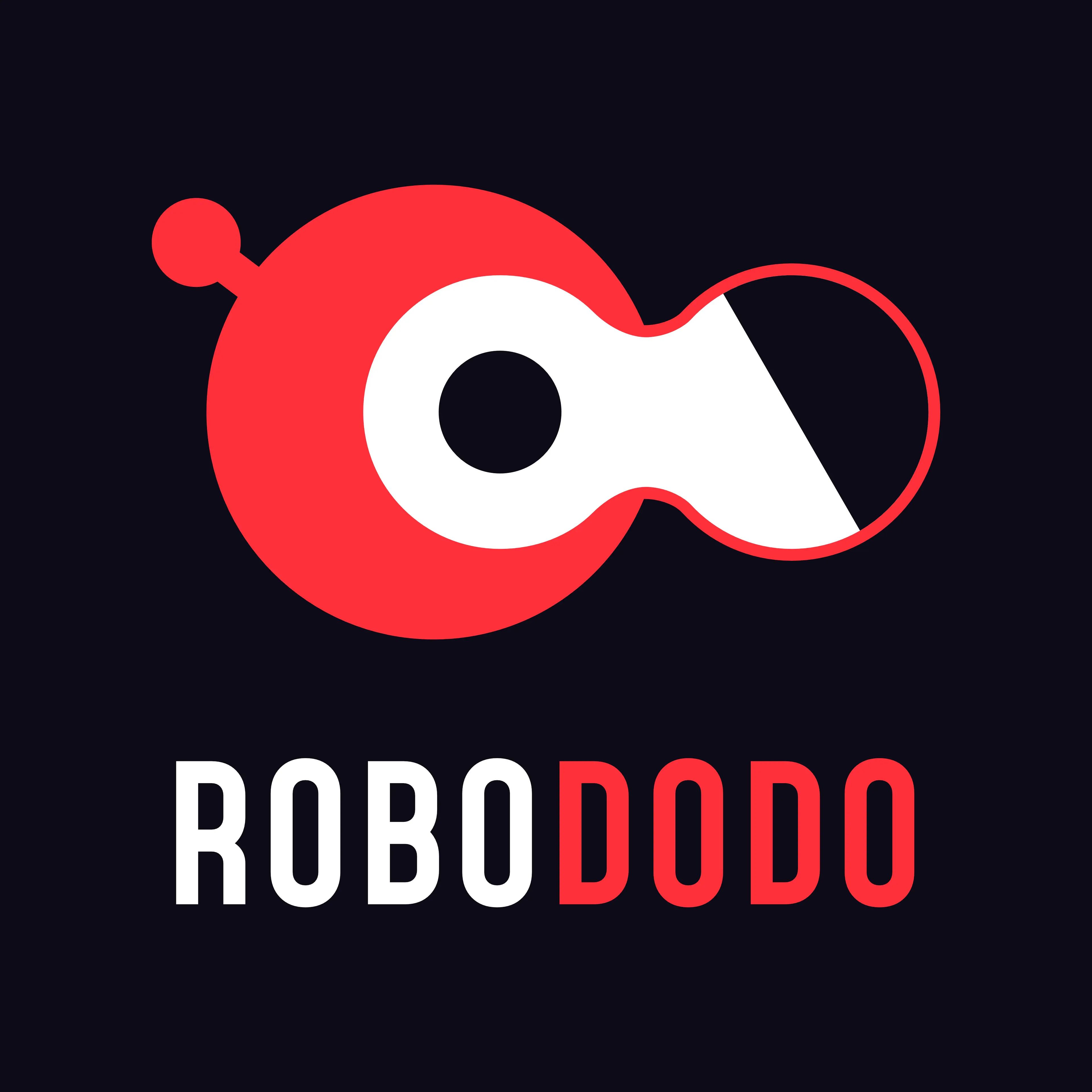
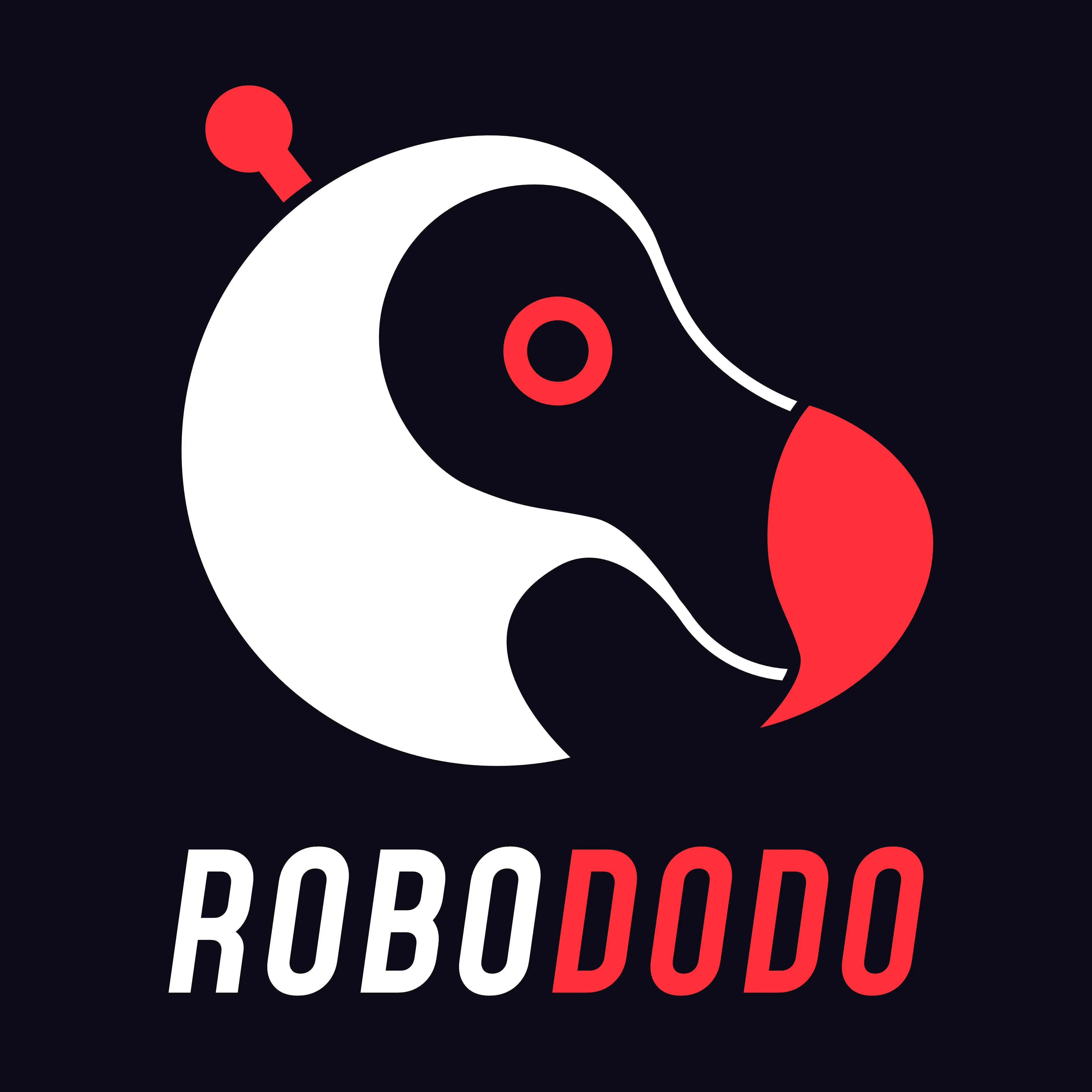
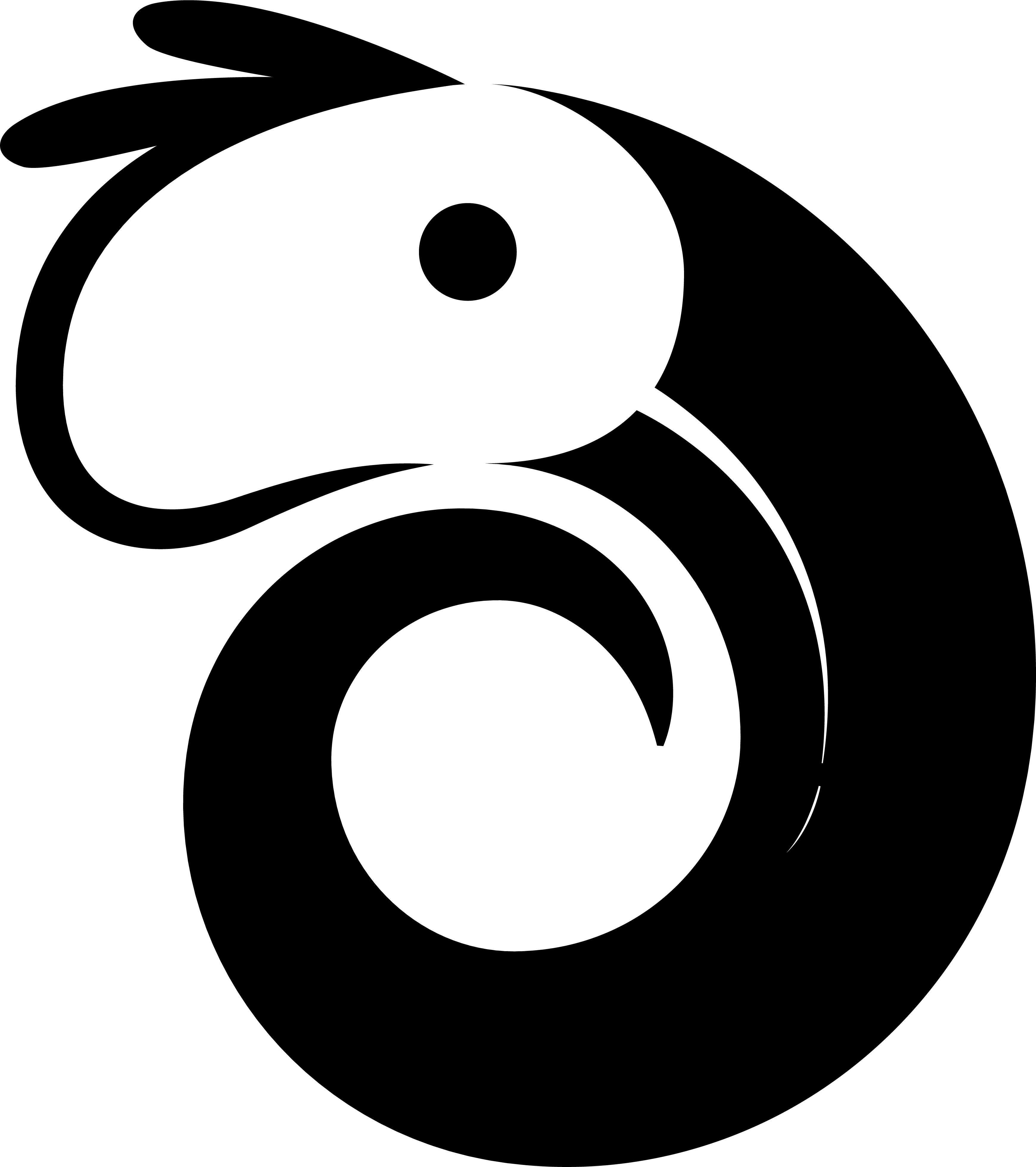
Robododo
September 2023
A commissioned logo for Robododo— an indie game studio. The first image here is a variant that was scrapped (which I am more fond of!), while the second is the final, approved logo.
Etrea
The Whirl Bill
January 2021
Done for the launch of my collaborative worldbuilding zine, The Whirl Bill.
https://www.worldanvil.com/w/the-whirl-bill
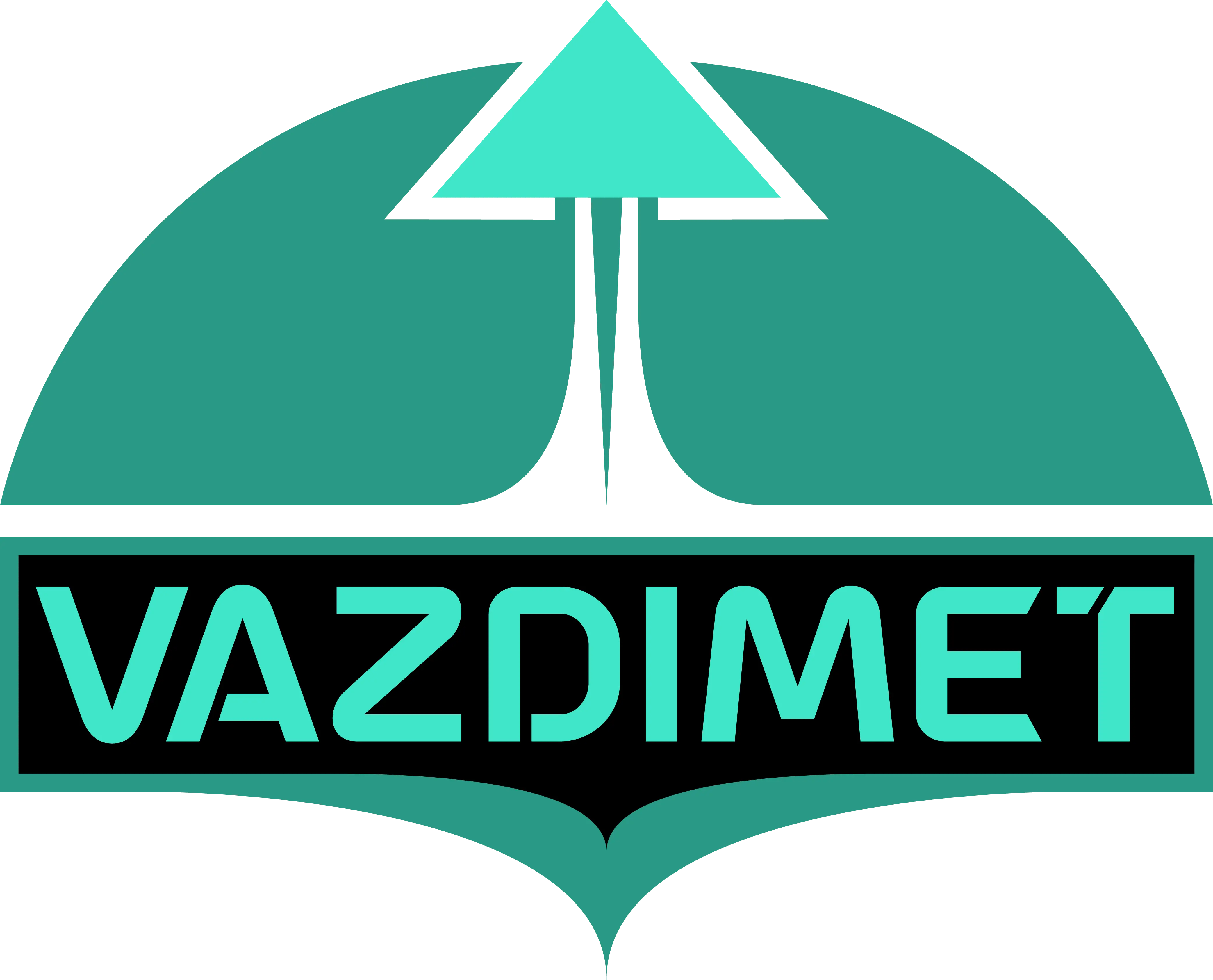
Vazdimet
I was commissioned to create a logo for the Vazdimet narrative setting. My client asked me to portray a hopeful sort of feeling, and to keep it in line with an earlier logo I had done for them. So, I depicted a ship leaving the atmosphere of a planet— given that this is a sci-fi setting.
https://www.worldanvil.com/w/vazdimet